User Interfaces
The ideal add-on is both completely unobtrusive when not in use and easily accessible when needed. Since users are able to add operators to their quick favorites, it is better to append or prepend functions to Blender’s existing menus or panels rather than add a new hotkey that could potentially conflict with the user’s custom preferences or with other add-ons. How easy a function is to get to should reflect, realistically, how often the add-on is needed in a typical workflow.
Placement
New menus, popovers, panels, etc. should only be created when absolutely necessary.
Any new header menus and tabs should be named generically (e.g. “Modeling” rather than “RetopoFlow”) unless there are so many contents that they need to take up a significant amount of space even when organized into sub-menus or collapsed. That way, they can share the space peacefully with other add-ons and not overcrowd important parts of Blender’s interface.
If an add-on appears in more than one place in Blender’s interface or introduces new top level buttons, menus, tabs, or panels, each new element should be customizable via the add-on’s preferences. Elements (e.g. a button in an editor’s header or a sidebar tab) should be able to be turned off and top level tabs or menus should be able to be renamed so that the user can organize their add-ons as they’d like.
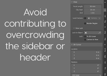
The sidebar should only be used if a control panel-like interface is needed, e.g. grouping several otherwise scattered functions together for ease of use, or if an operator fits nicely in an existing sidebar category (e.g. View or Item).
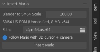
For example, the following add-on (which is extremely cool and fun) does not need a sidebar panel when it could be a single operator in the existing Add menu. The path option should be set in the preferences while the follow and scale options could be adjusted via the redo panel, saving the user from having yet another tab in the sidebar.
Single operators belong in the header menus of whichever editor they are used in. They should not appear in editors or modes that they cannot be used in. If there are several related operators in a menu and it gets too full, place them in a new sub-menu instead.
Modal operators that require interactive user input with a gizmo belong as tools in the toolbar, with tool settings that can be adjusted before use. Any tools should have their hotkeys displayed in the status bar. If there is no gizmo, place it in a header menu like a normal operator.
The right click context menu is for making common actions easier to get to. Your operators should not exclusively exist in this menu and the user should have the choice to remove them if desired.
Layout
In general, add-ons should look and behave as if they were built-in features. Native UI components and patterns should always be the default. In some cases, however, Blender’s interface may be too limiting. Overstepping those may be exactly what allows the user to work faster or in a more intuitive way. Custom interfaces should be used sparingly and should mimic Blender’s style so that users can immediately feel comfortable using it. Any custom fonts or icons that deviate from Blender’s style should be consistent throughout the addon and should not appear directly next to or mixed in with the native components.
Hotkeys
Registering new global hotkeys (hotkeys that work regardless of which tool is active) should be avoided when possible, and any new hotkeys should be able to be easily disabled or remapped via the add-on’s preferences.